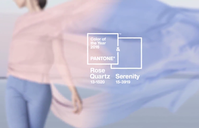
Well-known color expert Pantone released its Spring 2016 color forecast earlier this year. If you’re in search of a new look for your home in Scottsdale, getting to know which colors are on trend this spring – for both fashion and home décor – will give you some ideas. Check out which shades are popular at this time of year and how you can incorporate them into your Scottsdale home.
Rose Quartz: This was actually chosen as one of Pantone’s Colors of the Year. It’s a soft pink that is a no-brainer as the paint or wallpaper choice for a baby’s nursery or a little’s girl bedroom, but you can actually incorporate this throughout your house in a few other ways. For example, you can add a pop of pink to your family room by putting some rose quartz colored throw pillows on the couch. You can also find some candles that have this pale pink tone, or simply add some rose quartz rocks or seashells to a basket in your bathroom.
Serenity: This is the other Color of the Year selected by Pantone. It’s a cool, tranquil shade of blue that would look great in a bathroom rug, a blanket thrown over a family room couch, or as the paint color in a relaxing master bedroom.
Snorkel Blue: This is another shade of blue that Pantone states is in style this year. It’s similar to navy blue, with a slightly brighter tone that makes it perfect for an accent wall in a soothing family room. It looks especially nice when paired with crisp white, though it would also look great on its own if you used it to paint a shelf or dining room table.
Limpet Shell: If you’re still leaning toward adding some type of blue to your Scottsdale home this spring, but want something light and fun, Limpet Shell may work well. Similar in tone to aqua, it evokes a tranquil feel. You can incorporate this color into your décor by adding Limpet Shell curtains to your bathroom or kitchen windows, or by using sheets or a comforter in this shade.
Lilac Gray: If you’re looking for a fresh take on a neutral color, this is it. This spring shade combines gray and soft purple for a look that’s perfect for the couch in your living room or the walls of your master retreat.
Iced Coffee: This is another neutral color that Pantone has found to be popular this year. If you’re looking for a subtly earthy look for the interior of your Scottsdale home, consider this shade when you paint your kitchen cabinets or nook table, or perhaps when you need a new color for the walls of your home office.
Peach Echo: If you want a bright shade for spring that’s not quite peach and not quite orange, Peach Echo is a good compromise. A warm, welcoming tone, this spring color can give off a friendly feel, whether it’s on a casual couch in a family room or the accent wall in a bedroom.
Buttercup: No spring color is sunnier than Buttercup, which is a bright yellow shade that will definitely get the attention of anyone who enters your Scottsdale home. This color is perfect for your kitchen, since most people want bright, happy kitchens, and adding yellow is the fastest way to get this look. You can paint the walls this color, or add Buttercup curtains to your windows for a look you can easily change out once spring and summer in Scottsdale end and fall arrives.
Fiesta: This is another bright color that works well in kitchens. It’s a fiery red that can make any kitchen look more modern and exciting when added to the cabinets, walls, or simply the appliances.
Green Flash: If you’re looking for a bold way to show that spring is here, this bright green shade is the way to go. It’s perfect for the accent wall in a child’s bedroom, playroom, or library, or for the throw pillows you’ll toss on an otherwise neutral couch this spring.
If you want a more temporary option that you can easily switch out every season, consider celebrating spring by simply buying flowers in all of these colors and placing them in elegant vases throughout your Scottsdale home!
Don Matheson
Realtor | Founder
The Matheson Team – RE/MAX Fine Properties
21000 N. Pima Rd., #100, Scottsdale, AZ 85255
480-360-0281
don@scottsdalerealestate.com


